I drew my inspiration from products and services that were child centered. Since my product dealt with developing literacy, communication, social emotional well being I really want to be sure that where I sourced my inspiration was true to that mission.
Even though this is designed for preschool aged children I found their illustrations to be exciting and fun to look at.
The Orange Years: The Nickelodeon Story on Hulu
I found this inspirational, the entire mission and concept behind Nickelodeon was entirely child centered which was very unusual for marketing. Marketing is often centered on appealing to adults and what made Nickelodeon successful was breaking tradition and trying something completely different.
Mood Board
I went for a geometric playful feeling with my design. I fell in love with the typeface Euclid because how geometric and perfect the letter O was. It also was very easy to read at any size which I felt was important for school aged children. Depending on the typeface, it can be difficult for children to differentiate between the letters. I also really liked a minimally bold approach, I wanted the colors to pop without overwhelming the product. I was aiming to prevent overstimulation. The colors I picked because they were exciting, gender neutral, and they worked well together.
I aimed to illustrate how this product could be used to foster communication and combat feelings of isolation in children. Empowering children with the tolls to write letters provides them with lifelong communication skills. Writing letters is a great way to encourage children to take time away from their screens and tap into the world around them. Not only are they practicing expressing themselves, they are learning to pace themselves and listen to others!
Related Articles:
Magic Pen Pal Kit Storyboard
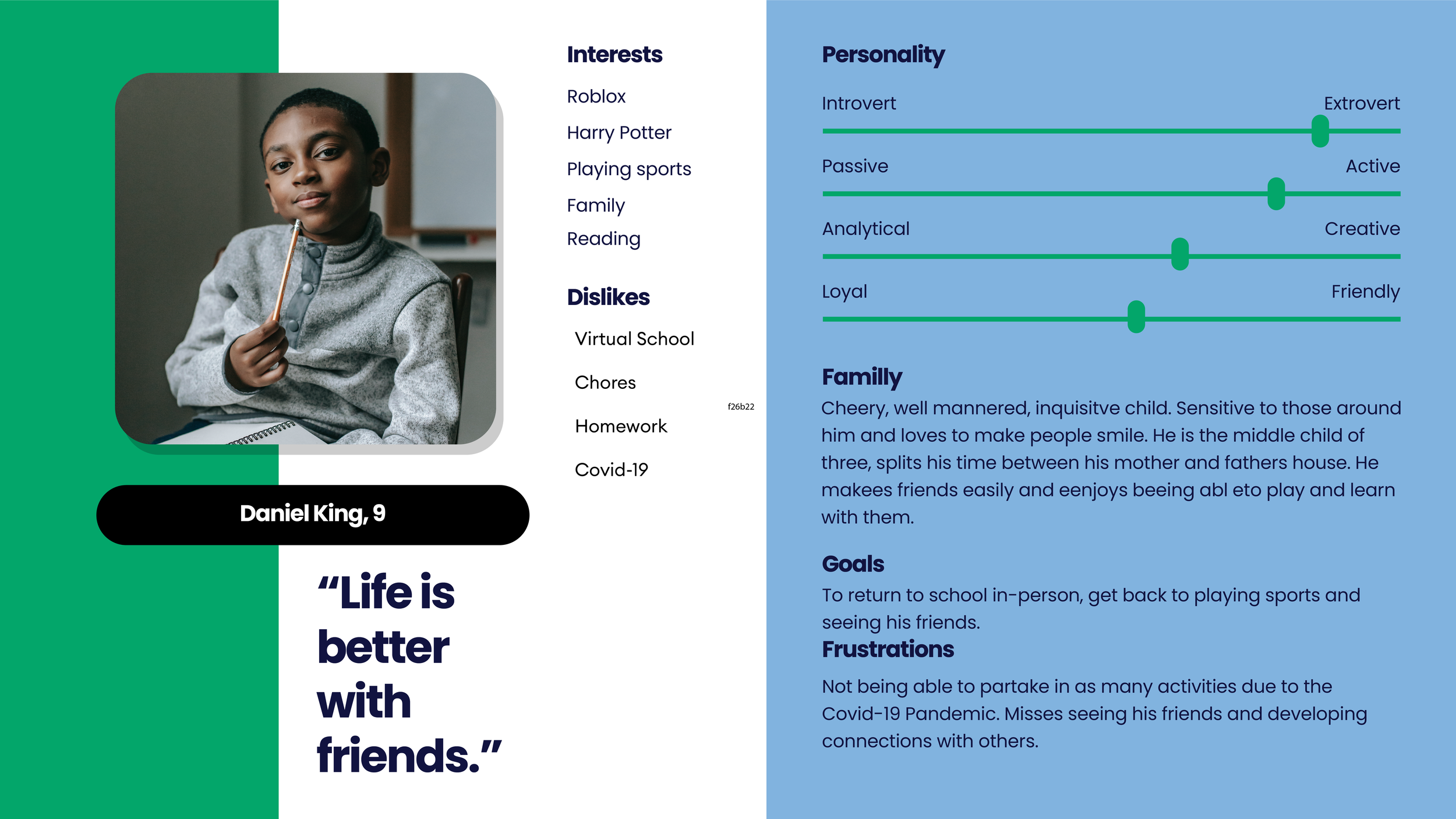
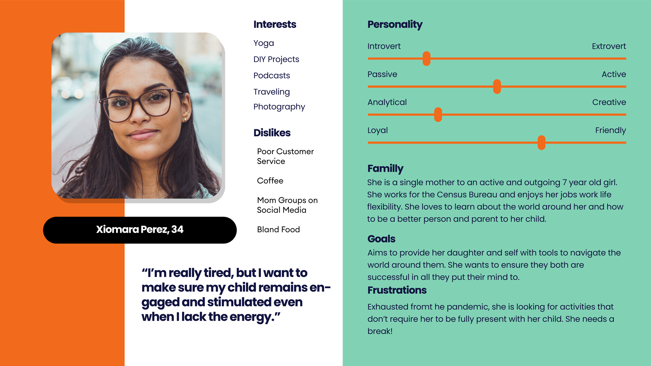
User Personas
I developed three user personas to help visualize and understand and identify my target audience. This also allowed me to cater my products and services to better fit their their needs.


