Goal
I aimed to design a product that was simple, kid friendly, and engaging. During the pandemic children were placed in a unique position that limited how they interacted with their peers. Since a lot of schools went virtual, many experienced fatigue while using their laptops, ipads, and other devices. Their playdates came to a screeching halt, or their social circles reduced. I wanted this to be something that allowed them to take a break from their technology yet still offered them the ability to communicate with their friends and family. I designed this children’s activity to be self-directed to instill confidence and intrinsic motivation.

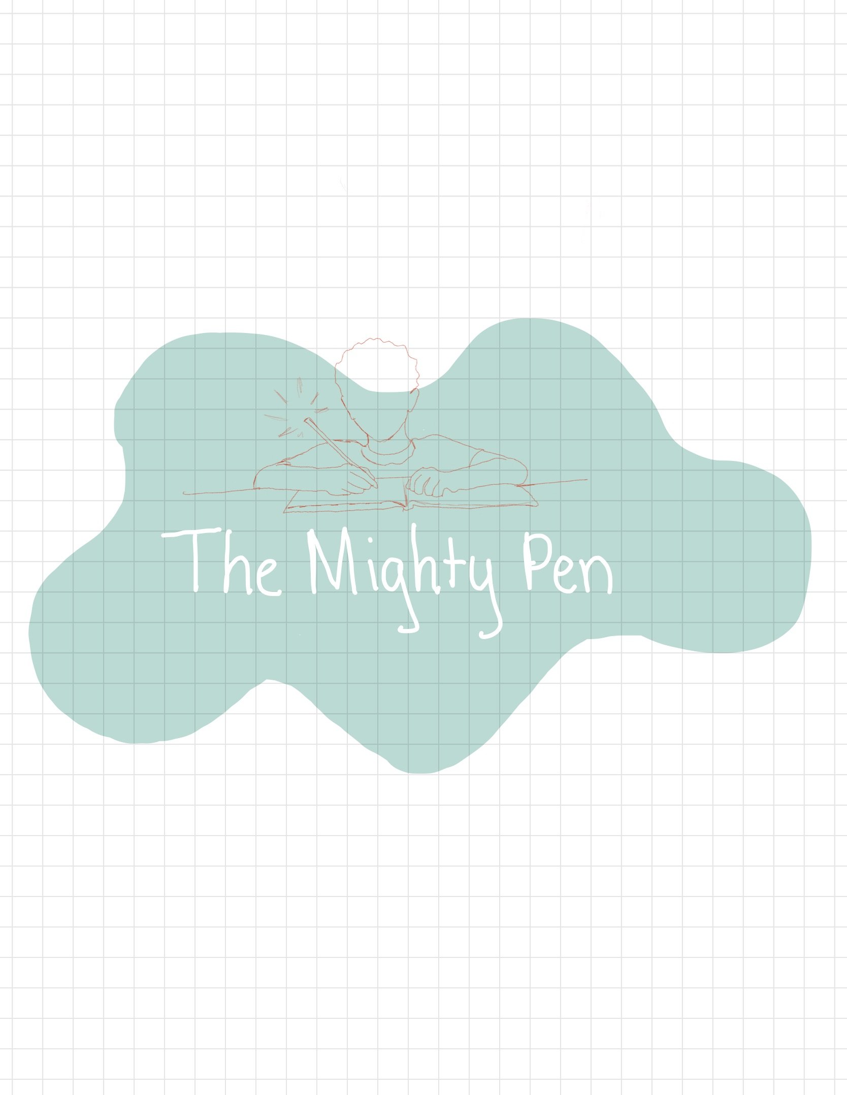
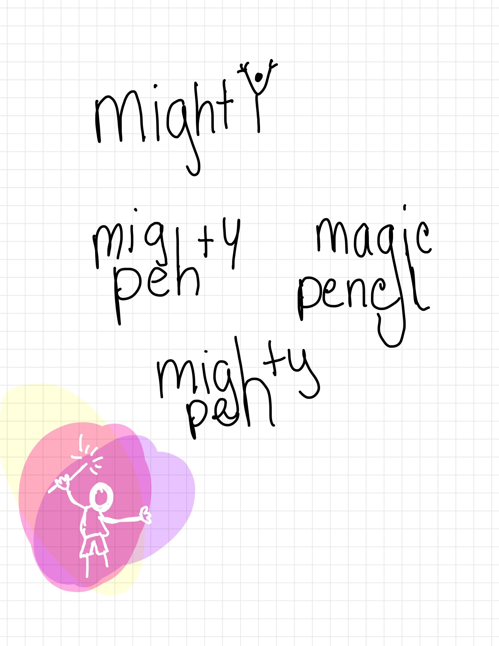
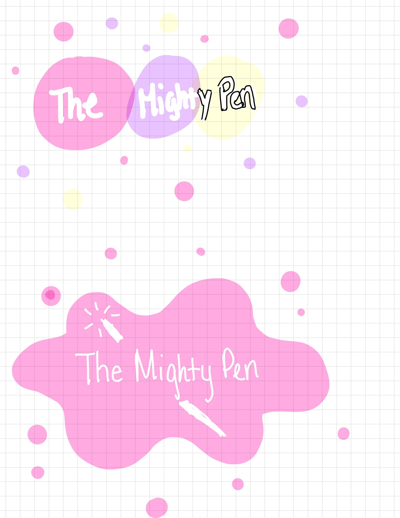
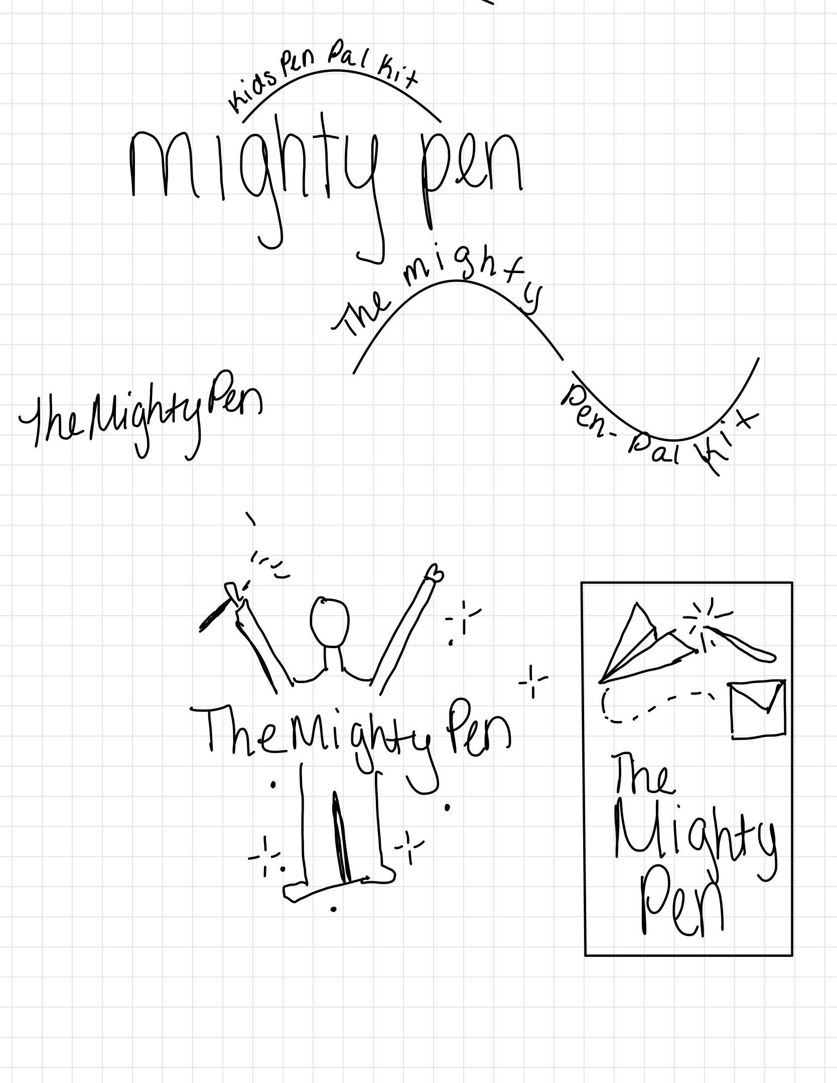

I knew I wanted to incorporate a writing instrument into the design but was unsure if I wanted a pencil or pen. So I sketched designs to see how I felt about them.
I rough traced this image of a young boy writing at a desk. I decided against it because once the image was scaled down, the detail would be difficult to see. I really love the wand-like effect and sought to demonstrate that children can be empowered through writing.
These were pieces of flair I thought would add dynamic energy to the logo.
This was a potential color palette I was working with. I decided against it because I didn't think it was as much fun to look at as the one I weent with. I chose the star and a hand holding/reaching for a magic pen. I really liked this design as well, but felt it was a little too complicated for what I was aiming for.
I used this image as inspiration, I kept having visions of the Sword in the Stone, and the idea of reaching for something magical.
I designed this logo and felt it was perfect for what I was going for. It was simple, not overly complicated and when scaled down was still legible.


